Tuesday, December 06, 2005
A7's LONG final "non-recipe" recipe.
As I sat last week discussing this project with my group, the topic of technology's advancement and complexity came up, but I didn't really explore it as much as I would have liked. I also posted a reply comment on my last project, with a bit of a rant about technology. First some background info on my "past life" and where this is all coming from.
About 5 years ago, someone looking in from the outside would have thought I had it all. I had graduated top-of-class with a Computer Systems Tech diploma, I ran a computer store, I owned a nice house in Ottawa, I had 3 cars, a $50000/yr full-time job... everything "appeared" on the surface to be going well. Unfortunately, things aren't always as they seem. Despite my high paying job, I was very unhappy. I was working as a PKI systems analyst for Entrust Technologies, assisting in the setup and deployment of the computer security systems for MAJOR companies, including the worlds top banks and firms. The stress this job provided in the 3 years I worked there was enough to last me a lifetime. Money has its perks, but my sanity was much more important. That's why I quit, moved to T.O and started a "new life" as an artist.
Why am I saying all this? Because it's important to understand that my education, knowledge, employment history, and subsequent disdain of technology, has afforded me a unique perspective on how I approach my work, and my use of technology in creating work. There used to be a rule among programmers: KISS (keep it simple, stupid). Programmers used to make software and devices so easy to use, anyone could use it, without needing books or training to do so. That's because back in the day, people were not as exposed to computers. Today, almost every household in Canada has at least one computer, but back then, you were lucky if 10% of households had a computer. So programmers needed to make the technology easy, for example, you press the off button to turn it off. It sounds funny, but think about it... How do you turn off a PC these days? Press the off button? Not a chance! You use the mouse, point to the Start button, select shutdown, click on turn off computer, click ok, wait 5 minutes for it to close everything, and then it shuts off. Ridiculous! Programmers take computer knowledge for granted. The days of KISS programming are long gone.
Anyway, back to the point. The point is I don't think any GOOD solution for amnesics should require "steps" like a recipe. It should be so utterly transparent and simple that ANYONE can use it, or more to the point, not even know they are using it.
So, after coming up with a tool for complex webpage searches, icons to use in a complex blog, and a complex map that uses an iPod, I'm doing a 180, and I'm going to talk about a totally different idea (my alternate idea from the first week). A concept that could be setup in a matter of days (the technology is simple and readily available) and could be helping amnesics by next month... and the best part is, they don't need to learn a single thing (assuming they know how to use a phone).
Enough with the chatter. Here's my non-recipe recipe.
Ingredients:
1 Windows PC to run the IVR
VoiceGuide IVR telephone software (http://www.voiceguide.com)
1 programmer to setup the system
The user's cellphone
The user's computer and calendar software
What is an IVR?
An IVR is an Interactive Voice Response software. Basically, it's the software that controls those fancy telephone menus that say "press 1 for support, press 2 for billing...". IVRs are very complex, and can be setup to read text from a database, make outbound calls, store messages, transfer calls, and more.
How it would work:
The user would simply go about their normal routine. The only thing they need to know is to call the IVR if they need help.
 For example, let's say John has an appointment at the dentist at 2pm. At 1:30, John will receive a telephone call. When he answers, he hears the message "You have an appointment at the dentist in 30 minutes. Don't forget to bring your wallet, your health card and your phone. Press 1 if you would like another reminder in 5 minutes, press 2 if you would like directions right now, or press 3 if you would like to hang up". John presses 1, because he is in the middle of lunch. 5 minutes later, his phone rings again. It plays the same message. This time John presses 2. The system then reads off directions to John, instructing him how to make his way to the dentist. So John leaves. On the way, John forgets the directions. He calls the IVR, programmed into his phone on speed dial, and gets the message "Hello John. If you need to leave yourself a reminder, press 1. If you need directions, press 2. If you need a list of appointments for today, press 3.". John presses 2, and hears the directions again to get to the dentist. He makes it to the dentist without a problem. After his appointment, the receptionist tells him he needs to be back for a follow-up in 3 days at noon. John calls the IVR and hears the same message as before, but presses 1 to leave a reminder. He hears a beep and says "Dentist appointment on December 11th at noon". He then makes his way back home.
How it works behind the scenes:
The programming and setup of the IVR would obviously be done by a programmer. It would be setup to link into the database of the user's calendar. That's how the appointments and call times are setup. The entire system is simply managed from the calendar, using a simple tool like iCal or Entourage.
Setting up appointments and maps depends on the individual user's severity of memory loss, and knowledge of the tools. In light cases, the user could likely set up appointments themselves. They simply listen to the memos they left themselves and enter them in the calendar as appointments. For maps, they simply enter the directions from a service like mapquest, or copy the directions from a list of pre-written scripts (for common locations that are travelled often). In more severe cases, someone else would help with the calendar. They would enter the directions and appointments into the calendar. The IVR takes care of the rest.
Why it works:
It works because it's simple. The user doesn't need to know why someone is calling and giving reminders, directions and help... it just does. The user doesn't need to know how to program phone scripts and messages, doesn't need to use complex palm menus and devices, doesn't need to understand technology. They just need to know how to answer a phone, and call a number.
Simplicity works. We should use it more often.
A7
Mazhar's Digital Reading Map
Here it is, the final project. From the beginning, my cell phone has been the tool for Virtual Community class projects. So i could not afford to avoid it for the final proj too. Cell phone is more my assistant in life. it notifies me important dates and times, organises my contacts, quick notes and many more. I think a pda like cell phone such as Nokia 6680 (Nokia 6670 - similar feature phone in Canada from the doggy Fido) can be really handy.
When i drive to a new location, i get the route map from google and save it on TextEdit or Illustrator and export as PDF. Then i transfer the pdf on the phone via bluetooth and view as full screen on phone. Thats all i need. No prints, no remembering. As i cross each direction steps, all i have to do is hit the down arrown key and scroll down. makes life more digitally easy.
Thanks to Nokia, Apple, Bluetooth, Adobe. Life is really getting digital as long as you keep the freezing and overheating Microsoft away. But hence we are all going lazy too.
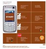 Anyways, for this class, i have converted my flowchart style map into slideshow to be displayed on phone.
its a more custom. it could be more practical too if we were to make a template for indesign and then export as pdf, transfer via bluetooth. I think that would require indesign knowledge, for those who dont, a software could be programmed or a webpage where it will create pdf automatically, there r some pluginns for webprogrammers in the market tat facilitates this option.
Though my image example post is based on my flowchart map posted earlier, It could be made more easy with actual directions. Once user requests driving directions on google map or mapquest or yahoo, an option could be made where by user could download as pdf slide for cell phones. Similar to print now feature which opens a new window with same content with less graphics. Bluetooth is already a standard feature on all phones and computers now, so i really believe this could be an handy feature. How many can afford a gps system on their cars... so this is economically (or freely) practical.
In between - the same could be applied on other new models from motorola, samsung with pdf support. unfortunatly north america are beind europe and asia in mobile tehnology. if we were competent with other locations... we could have used the phone to access map website and auto download the pdf which would avoid the steps of indesing, computer and bluetooth transfer. but hey, they are only few months away from being practical. lets cross our fingers and hope somebody does it, call google.
Mazhar Mohad
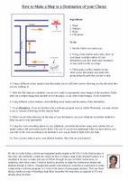
recipes for simple tools
hello,
this is my final project for virtual communities. i have drawn on some very simple ideas that may not seem to be very creative, but the goal was a little different. it is all explained in the instructions. here they are.
i wish you all a great christmas.
Memory tool techniques that are not technologically driven-when one thinks of memory loss safety tools, the benefits that technology offer come to mind as fool-proof devices that should offer security to someone whose lifestyle cannot rely on their own memory. However through the process of this project my interest slowly became focused on computer programming tools. But what I have been thinking about lately is the need to come back to the beginning. I am interested in writing instructions for very simple tools that anyone could follow. Either a Patient of memory loss or a friend or family member that wants to make some quick and easy tools that are more personal in regards to special needs. (i.e.: an emergency map card to the closest veterinary clinic)
Both of these tools can be created with computer technology, but it is not necessary and in some cases not as easy. The goal of these tools is to create simple maps and records that a person with memory loss can make and use without the need to depend on computer technology.
Although both of these tools remain very simple, the idea is not to construct something complicated, but to give instructions to something very basic for those who don’t know where to start or as a means to create a tool that is better, more sophisticated and more personal.
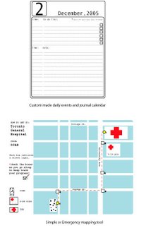
First tool for organization:
Custom made daily events and journal calendar
What you will need:
-paper of a chosen size.*recommend at least 8.5x11” (378 sheets)
-thick and thin black marker
-ruler
-a template for organizing: should include a spot for the date at the top to be written in large letters and a spot for the number of the day (*I have included a sample that can be copied)
-a ‘to do list’ with check boxes at the end of each entry
-a list section for any details or events that wish to be tracked. (the idea is to keep a memory of what ever your wish. This is not a list that is limited to daily events or meeting’s. for example-12:45-john the neighbor dropped in-Didn’t like him!
-access to a photocopier
What you will do:
-first take1 sheet of paper and make your template using your thin marker-I have included one to make the process easier
-then photocopy the template 12 times (making the contrast a little darker is a good idea because these templates will be copied again)
-next take your 12 pages and with your thick marker, write 1 month of the year on each page until the twelve pages complete the year (it is also good to include the year)
-take the 12 templates and copy each one for enough days to complete each month
*make sure to refer to a calendar to make sure the number of days are accurate
-the numbering of each page can be done either all at once or day by day
Second tool for organization
Simple or Emergency mapping tool
What you will need:
-a map of your area, city or town, with the location of your home marked clearly.(this will be used as a reference when making your map)
-to identify the destinations that you will want to map for quick reference(ie:the nearest hospital, some close friends homes, the veterinary clinic, post office ect.)
-any type of paper or card stock to write on that you wish *keep in mind that the maps should remain small enough to carry easily
-pens, pencils-at least 2 different colours is a good idea (*I have included an example of this simple mapping idea)
What you will do:
-chose the destinations that are important to you and take the best route to get there
-take your map and as you go identify markers that are less likely to move (traffic lights, cross roads, easily identifiable buildings, parks ect.)
-with your makers and routes draw out a simple version of the route and at where every useful maker is located make a small check box
-number each check box in order until the destination
-include on your map the destination, the starting point and what the check boxes represent
-you can either chose markers that are all the same—like traffic lights-or you can use lots of different makers-either way make sure to identify on your map what maker is where on the route (*this is the only way to track your progress and keep you on moving in the right way)
-keep these small maps with you, either in your day book or wallet so that you can access them when needed
Friday, December 02, 2005
track your progress

Hello everyone,
i wish you all luck in the darkest days that are FINALS!!
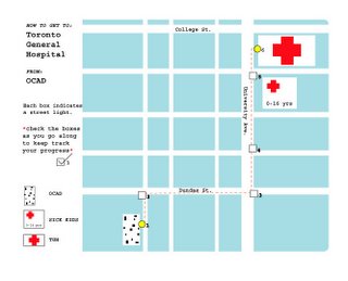
The Tracking Map:
in this project i wanted to make a map to a destination that was also a tool to 'track your pogress'. primitive though it is, the idea is clear.( I hope! :} ) In paper form the user would use a pen and check each box to make sure they have reached that point on the route. i was thinking about what we were talking about in class. designing a tool for the user with the highest needs. Like watching the plot of a movie, I was concerned with the idea that a person with server amnesia would not be able to reach their destination. i tired to keep this in mind. but the tool is still useful for a person with a mild case of amnesia and the result would be the same. the maps check boxes are used to identify ONLY traffic lights as markers as thees have the least chance of changing.
the design of the map is trying to stay within the theme of my last project. I wanted to keep it as simple as possible(but still include a design aesthetic), so that it remains clear and user friendly. For example, if this form of information took the shape of a card that could be kept in a wallet or a small book that could easily be carried maybe this idea would be comfortable for some of the patients at Baycrest that don’t feel comfortable with a complex PDA device.
i am thinking about adding these types of maps to my PDA "heart monitor" program. but they would have to be modified. obviously very few users would be starting from OCAD.
Tuesday, November 29, 2005
Recipes for an Orientation Device Cookbook
OK folks - here's the write-up for the last "orientation device" assignment. In today's class, we'll get a jump on this.
••••
ASSIGNMENT : ORIENTATION DEVICE : Part Four (Final)
Assignment description : Associate Professor Judith Doyle : jdoyle@faculty.ocad.ca
Recipes for an Orientation Device Cookbook
Now we will adapt our ‘orientation device’ ideas into recipes that “users” (amnesics) can prepare or customize for themselves, in collaboration with others (caregivers, computer programmers, artists & designers, family). Altogether, our “recipes” will form an online “cookbook” we will present to our friends at OCAD, the Baycrest Centre, U of T, and others. Your final assignment is to create the recipes and assemble illustrations, pictures, bios, and artists’ statements for this - a “collective memory” of all the project ideas we’ve completed.
Reviewing our past orientation device assignments ( 1 – 3 ) :
• You chose memory impairment problems to address, and tools to solve the problems with. You posted your ideas to the blog.
• You created a set of multimedia “emoticons” (reminders for feelings). You posted your files and wrote about your development for the blog.
• You created a memory map using multimedia signposts from OCAD to nearby destinations. You posted your maps and descriptions on the blog.
For this assignment you will convert your ideas into simple instructions. I will use Tara’s project as an example. She suggested using documentary video clips to trigger memories of friends and of emotions. Her “recipe” might sound like this :
Ingredients :
- a video camera (could be a feature of a cellphone, PDA, web cam or digital camera
- file storage (could be in a computer, online, in a PDA)
• using your camera, shoot short clips of footage of yourself with a friend during everyday activities.
• download files and label with your friend’s name, the place and date
• give the file an emotion’s name (fun, annoying, too noisy, happy)
• index these files so they can be searched by topic, name, date or emotion.
To do : 1) write up one or more of your ‘orientation device’ assignments in the form of a recipe, or “how to” set of instructions. These instructions should help “user-participants” create their own set of emoticons or map of signposts.
2) include a picture of yourself.
3) prepare files of your visuals, MP3s and any other text you’d like to include as an “artist’s statement”.
4) upload to blog. If necessary, bring large files to class on storage media (CD Rom).
Sunday, November 27, 2005
Passionate Eye : Monday 10 PM CBC TV -- AMNESIA!
Tomorrow (Monday November 28) at 10 PM on CBC TV on "The Passionate Eye" a documentary is airing about amnesia. The story focuses on Clive, the musician and BBC producer who is experiencing an especially severe form of anterograde amnesia.
It gets great reviews. Watch if possible -- oh, and your work is looking very good.
Tuesday, November 22, 2005
Lydia's map from OCAD to St. Patrick Station

Hey! Sorry I couldn't make it to class today, I posted the assignment as soon as I got the chance. For this part of the assignment I made a map that incorporated images and text. The map is from OCAD to St. Patrick Station, a destination that I make almost everyday. I made the path blue and large to show the simple outline of the destination. I then used simple images of the locations, images that would be easily recognizable. These are images of the locations, or places that are known to be found in certain areas along the way. The yellow dots represent the path that is taken by the person and the arrows represent the direction that the person should be walking on. In case the person needs exra instructions to go with the visuals, I included easy to follow instructions that include some ryhmes. This way the destination would be easily remembered. This map is intended to be simple and easy to follow through its images, text and colour codes.
A7's mapping project
Hi all,
My project consists of a photo work for the iPod. Since I can't quite use the blog to demonstrate what I mean, I have created a video that simulates what it might look like on the iPod. I will also bring the iPod to class for a demo if anyone is interested. Warning! The video is 36MB, so it may be slow loading on some connections. Here is the video: iPod simulation
The idea behind this concept was to use photos on a portable media in a way that simulates a high-tech visual compass. The new color and video iPods have the ability to store slideshows and photos that the user can navigate easily from the iPod. So I set out to create a photo map. My map goes from OCAD to my favorite pizza joint, Pizzaiolo, with a stop at the ATM for money. I took several pictures of the walk from OCAD to Pizzaiolo... about one every 20 feet. So someone could be holding the iPod in front of them to locate themselves (match up the photo to the real life view), and look at the next picture to see where to go next.
The reason I chose this concept was because I enjoy the transient nature of the landscape. What may be a good photo map today, may not be useful next week, as our environment is in continuous change. Nothing is permanent.
A7
Flowchart to Second Cup
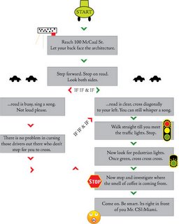
Hola people. For the mapping, i did a flowchart kind of map with icons. It starts from our campus to Second cup on dundas and mccaul. I was working on ASP database programming and were constantly refering to the flowchart i had created. Then suddenly i thought why not use the same standard to reach a place. to make it more fun, i thought to integrate some sort of icons to represent the box. That could come into affect if the flowchart was used de second time. Ah! I can sell it to those genius computer programmers from South Asia. :)
Mazhar Mohad
the heart monitor face

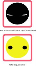
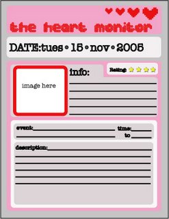

hello, its teresa
this is the next stage of my 'heart monitor' idea. for this emoticon assignment i am designing the whole look of the program along with the face emoticons and the small images that make up the over all 'look' of the program. i am becoming increasing more interested in a sort of 'hyper design'. design that creates is own iconic look. the first two emoticons are up and more will follow. i am not so great with illustrator. but this gives an idea.
assignment #3: my idea is to make a 'best restaurants of the west side' kind of mapping system. staying with the idea of memory loss i was thinking that a restaurant guide would be something that i would appreciate. just because you cant remember what places have great Mexican -lets say- doesn't mean you wont enjoy it when you get there. i have a list of places but i still have to gather the visuals.
Wednesday, November 16, 2005
Orientation Assignment 3 - Due Nov. 22
Hi Folks - Here's the write-up on the assignment we discussed in class yesterday. You may work in groups of 2 or 3 if you prefer on this :
FYI - the mark breakdown - during the "orientation device" segment (Judith's part) of the course, there are 4 small assignments, each worth 10% of your final mark. There is no big or final project! Instead, we will gather all of the small assignments together into a web site that we will present publicly at the end of the semester.
+++
ASSIGNMENT : ORIENTATION DEVICE : Part Three
Assignment description : Associate Professor Judith Doyle : jdoyle@faculty.ocad.ca
Assignment 3 - “Just a Walk” signposts
In a series of short stories called “Just a Walk”, Ojibway teacher Ron Geyshick used a traditional form of storytelling that combined exciting spiritual encounters and events with descriptions of landmarks along his walking route. Thus, his story could be remembered and used as a memory map to find your way around the forest.
Maps can take many forms, and many experiences and concepts can be mapped. For this assignment, you will create a series of “signpost” drawings, photos, words, audio or video clips from OCAD to a nearby destination of your choice. Alternately, you can create a “Just a Walk” story of your own, or based on the experiences of a friend, collaborator or imaginary Avatar. Like clues in a treasure hunt, your “signposts” will be used to help someone reach a real world destination – a doctor’s office, subway station, coffee shop, homeless shelter, or even a hard-to-find office inside OCAD are possible destinations.
Upload your files to the web, and provide a link on the class BLOG. Write a brief report on your development process.
Due Date : Tuesday, November 22, 2005
Tuesday, November 15, 2005
Lydia's Orientation Device: Part 2

For this part of the assignment, I decided to use stick figures to represent various emotions. So I drew various figures with different body languages. I thought the use of stick figures can easily represent a person’s emotion. Whether they be happy, relaxed, playful, angry and so on. I believe that emotion is best represented through body language, because sometimes words cannot fully express one's emotion. So the stick figures would represent these body languages and yet they are simple enough to create for a device like the palm. I thought that in terms of the colour that would be up to the users. For example, when they feel very angry, perhaps they would pick the figure that best represents that and add a vibrant red, or whatever colour they feel like using at the time.
Mazhar's Pay reminder
The most issue i find myself is paying my bills on time. I keep forgeting the due dates and i have paid late fees quite often for missing due dates. Then i started using the pre-authorized payment methods. But then i kind of never bothered how much i was paying.
The solution i figured out was having symbols display on the calender. There are different ways one can proceed. On applications (pda/phone/ical), symbols will show up on respective dates. Clicking on the icon will display further information. I have used 3 examples in the image.
On the desktop screen (or similar for any pda or cell phone) or the background screen - these icons can display on the TO DO items as well.
Mazhar Mohad
